Back in August Google rebranded itself as “Alphabet”. Well that’s how the media covered the story. In reality the Google brand is alive and kicking out a hundred billion search results every month, looking pretty much like it has done for many years. The Google brand identity is intact and as well protected as any brand with revenue of $66bn per year should be. It went through some evolutionary changes in September of this year, but the consumer and business facing search engine remains largely unchanged.
So what did Google do that created such a media storm? It restructured and branded its holding company as Alphabet. The restructure itself makes a lot of sense. The holding company is a collection of businesses that range from making glucose-sensing contact lenses and driverless cars to Calico which is tackling ageing and aiming to help people lead longer and healthier lives. In this Thought, I take a brief look at this as a branding exercise and review the new Alphabet brand.
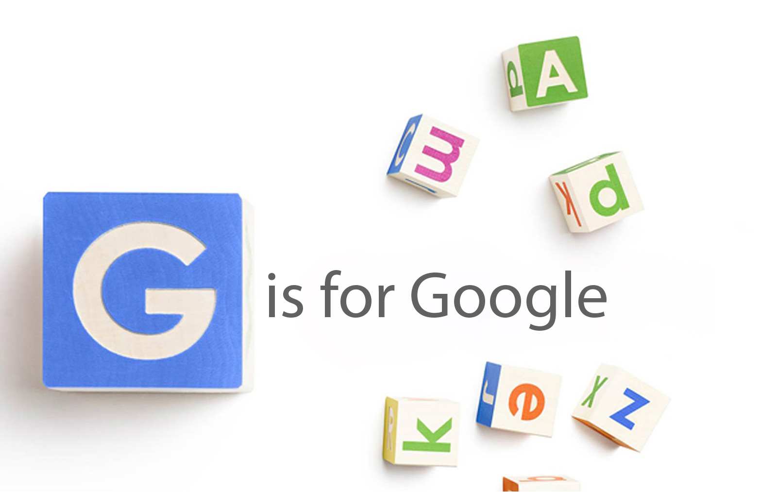
Is Alphabet the right name?
Let’s start by looking at the naming strategy. Does Alphabet work as a new brand name for one of the world’s largest holding companies – a company focused on investing in the world’s future technologies? The thinking behind the naming strategy can be summed up as “G is for Google but that’s just one of the letters in the holding company’s portfolio.” It reflects the Alphabet soup or Alphabetti Spaghetti that is the mashup of technologies and brands owned by the new holding company. At a stretch, they also like the fact that it can also mean alpha‑bet where Alpha is an investment return above the usual benchmark.
Brands are a mixture of rational and emotional factors. Larry Page stated in the press release “We liked the name Alphabet because it means a collection of letters that represent language, one of humanity’s most important innovations, and is the core of how we index with Google search.” If an independent branding agency had used that as part of a rationale for a new brand for a major corporation, they would also have to be prepared for some abuse from the client!
In fact Alphabet probably wouldn’t have got past the first stage with many branding agencies who generally look for something unique; alphabet.com is owned by a UK based commercial vehicle leasing firm (Google’s Alphabet uses abc.xyz) and a quick visit to the UK Companies House reveals an alphabet of existing companies from Alphabet Advertising to Alphabet Zoo! In a world where you can create a brand like tumblr without a flickr of the eye, why settle for something as pedestrian as an existing name?
The emotional logic is also thin. This is potentially a company that will shape the future of our planet. It is crying out for a name that evokes a better world, that creates a difference, that is far more than a “collection of letters.” At the same time, this is a holding company that needs to attract and reassure investors. It is not a consumer brand. Its target markets are financial ones such as pension and investment fund managers and high net worth individuals. A new brand name needs to reflect security, trust and stability as well as the excitement of future growth. Does Alphabet do that? Not for me.
One of the issues with not outsourcing to an independent branding agency, even if you have the skills in-house, is the possibility of “groupthink” (particularly where you have strong charismatic leaders). Too many people all nodding their heads at the same time! Pure speculation of course, but overall, it seems that Alphabet is a bit of a lazy choice.
Is it the right logo?
![]()
Google (now Alphabet) understands brand identity. There’s a great article from Google itself about Evolving the Google Identity. That article describes the creation of the Product Sans typeface which is used by Google and for the Alphabet branding. A typeface that works particularly well in a digital world of screen sizes that vary from smartphone to UHD TV.
The use of that typeface and nothing else is clever in its simplicity. Many branding agencies would be tempted to add a graphic device that creates more of a consumer facing brand and evokes some of the emotional attributes mentioned above. But as already stated, this is not a consumer brand. The typeface is clean and simple and does of course relate to Google. So on this aspect top marks.
The use of red is interesting with its hints of passion and danger that are too risky for a corporation targeting financial markets. But it also evokes excitement, urgency, style and energy which do seem appropriate. It may have been just a style choice, as the only one of the four Google colours that looked any good on its own! If so, again possibly a lazy choice that an independent agency would have at least debated.
Overall, whether or not you like the name, this is a great design. Well done team Alphabet!
Should it have a strapline?
Having argued that the clean simplicity of the typeface, without a graphic device, enhances the branding, it might appear difficult to suggest that a strapline will help. However, given the failure of the naming strategy, there is both a need and an opportunity to move Alphabet forward with a strapline. Something aimed at the financial markets that both motivates and clarifies purpose. Something that embodies the excitement around the innovative technological changes Alphabet’s investments will bring. Not quite as dramatic as Buzz Lightyear’s “To Infinity and Beyond”, possibly more along the lines of “Investing in the World’s Future” (used by Kofi Annan at the UN) but with a bit more excitement. How about “Vorsprung durch Technik” or has that been done?
It will work anyway
The sheer power and weight of the association with Google gives the Alphabet brand a huge amount of instant credibility. The level of finance it controls as a holding company gives it kudos and weight with the financial markets. In that respect, particularly as it is not consumer facing, it doesn’t matter if the name is not the best one. It doesn’t matter if it has a graphic device or a strapline or if the typeface and colours are appropriate. Alphabet will succeed and its subsidiary brands will enrich our lives through world changing innovation. Sometimes visual identity and what most people think of as branding are eclipsed – for good or for bad – by the power of a brand’s strategy, product or service. Now has anyone got any ideas for a strapline?
Image credit: Alphabet
Categories
The Old Bakery, 90 Camden Road
Tunbridge Wells TN1 2QP