Sam Strudwick,
Brand vs Brand
Categories

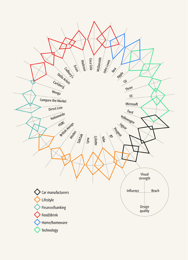
Recently I have been thinking about television advertising. It was a particular John Lewis Christmas advert that had got me started. How some adverts are brilliant pieces of convincing branding. More than an annoying jingle and silly mascot. On this train of thought I was thinking about the brands behind some of the television adverts I could remember. And started to consider why certain brands are so popular, why you find yourself sticking to or being newly convinced by a brand. We are drowned in hundreds of different brands everyday. They cover our television screens, products we purchase and fill magazines we read. As a designer and whilst being at Grain, branding itself is something I spend a lot of time considering, with a number of different elements to evaluate from many different brands. What better to visualise these factors than a good infographic!
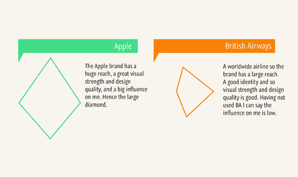
The infographic visualises and compares my impression and opinion on some popular and well-marketed brands. I broke this down into four main criteria. The visual strength, the reach, the influence (on myself) and the design quality. These things don’t need quantifiable results. The infographic works on illustrating how well each brand ‘scores’ under each category, shown where the point of the diamond meets each axis.
The size and shape of each diamond portrays the strengths of each analysed brand. Essentially, the bigger the diamond, the bigger the brand and I would say the better the brand, however this is purely my own opinion. And in no way a true reflection of the brand itself. They are further categorised by ‘product type’ as the colour coded key shows. Contrasts can be seen between brands of the same product and then against any other as well.
Categories
The Old Bakery, 90 Camden Road
Tunbridge Wells TN1 2QP